FONT FRIDAY :: Quick-Death

Featured Font : Quick-Death

This week's font can be scooped up for only $10 (50% off), which is less than a lunch in Boston.  Quick-death was designed by UK-based designer Adam Greasley.  As you can see from the two images below, the font can be either pretty cutesy or have a bit of an eerie undertone.  It is also full of quirkly little irregularities.


You can purchase the font HERE at the discounted price (50% off) until June 12th.  I would also HIGHLY recommend checking out the designer's instagram feed HERE.  He posts a number of gorgeous font-in-progress hand sketches, I personally love seeing the process behind the product!

As you may have assumed I have a thing for fonts. They come in all shapes and sizes with elaborate swashes and elegant details. The right font can easily make or break a design. Every Friday, I’ll share some of my favorites and recent purchases here, hoping to inspire a typography addiction in everyone.

For additional font inspiration check out these lovely ladies:

Little Bit Heart | Lauren Elise Crafted | Bubblerock | Hank + Hunt | Super Swoon | Blush Printables | The Aerialist Press | Palm Papers | Allison Owen | DesignEditor | WesWen Design | Everything Nice

I try to keep my font sheet updated with recent purchases, but if you see a font you love on here and would like to incorporate it into your designs just let me know!

Welcome :: A New Adventure

If you were directed here from my old site, 4th&Folded, let me be the first to say Welcome! Two years ago, when I started this business I could not fathom the idea of how both myself and my life would change with the addition of this little venture.  Like many businesses starting out I quickly conceived the name ‘4th&Folded’ one weekend, eager to put myself out there and capture my first customer.  Regretfully, I have never been attached to it like I should be.  I’m very passionate about my business, about creating and design, and feel that I should be equally passionate about the name that stands for it.

After much deliberation, I have decided that 4th&Folded will be no more, and in its place will stand Chelsey Emery.

I knew I wanted my new brand to be more of a reflection of myself, based on nothing more than everything I love and what I want to stand behind.  To me, that is simply Chelsey Emery, my namesake – as nothing else could better represent who I am, as a designer and as a person.  As you may have guessed, Chelsey is my first name, but in lieu of my last name, I’m choosing to use my middle name, Emery.  It is also my mother’s middle name and it reminds me (as she does) to be strong, independent and good; to work hard, play often and that life is too short to not have fresh flowers.

With the new brand and name change comes a new website, take a moment to peek around and see whats new, although we have lots of new content coming shortly!  The website changes (and future online shop) would not have been possible without the efforts of the talented Micheal Cain (one half of the Map & Menu duo) who has answered all my tireless questions and done all the background coding that I am clueless about.  Thank you Michael!

This new brand has been in the works since last July, (so if we have worked together recently you may have already had a little sneak peek!) but I had been putting off the launch (again and again) wanting to wait until everything was perfect.  Lately, I came to the conclusion that it will likely never be perfect, and thats okay, because as the Making Brands Happen girls reminded me, Done is better than Perfect

Although the name has changed, it is still the same great company with a commitment to making happy customers and delivering quality products.  We will have a online store shortly, and are always brainstorming new and exciting products, so check back often!

*all photos by the talented Meredith Perdue

From the Studio :: Gender Reveal Cards

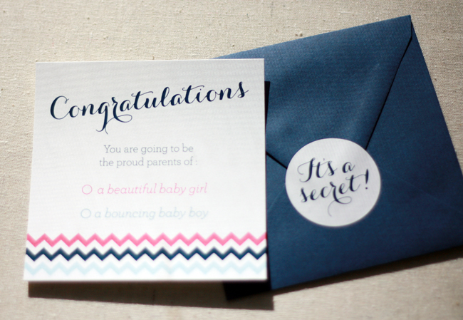
As some of you may know, we are expecting our first baby (a little girl) in early July.  But before we knew the gender we had the all important discussion on whether or not to find out, one of us was in the 'I want to know' camp, the other in the 'Let's wait' camp.  With the ultrasound appointment fast approaching and nary a decision between us we decided to have the technician write down the gender so we could find out in our own time (and not in a poorly lit room with jelly on my belly).  I suppose I could have had the technician write down the gender on any 'ol piece of paper, but that is not really my style; plus I wanted photos of the, um 'distinguishing features'.  I pulled together this little Gender Reveal card knowing it would make a great keepsake for the baby's memory book.

The card is sized at 5" square and comes paired with a dark envelope and coordinating "It's a Secret" sticker to discourage any peeking.

We chose to open our card a few days later.  We made a reservation at an nice local restaurant we had been wanting to try (I highly recommend 80 Thoreau if you live around Boston, the food and service was to die for) and opened the card that would change our lives while waiting for our entrees.

Whether you choose to open your card surrounded by family and friends, or just the two of you, either way it will provide a timeless keepsake for years to come.  These will be available on our website shortly, but until then feel free to pick one up through our Etsy shop.

Improper Bostonian Feature

Back in October, Lindsey from the Improper Bostonian contacted me about my Finn invites.  She was sourcing items for a series of wedding inspiration shoots for their annual wedding issue and thought Finn would be a perfect fit for an Anothony Massullo inspired wedding (think bright and fun).  I changed up the color scheme and patterns a bit to complement the artist's paintings and sent them off! The feature can be seen online here and if you are local to Boston you can see the full spread on page 43.  Special thanks to Lindsay for including me in the feature!